


In this tutorial ,I will explain about React Native Bottom Tabs Navigation Example Using React Navigation.
Possibly the most common style of navigation in mobile apps is tab-based navigation. This can be tabs on the bottom of the screen or on the top below the header (or even instead of a header).
Mostly every app now a days have bottom tabs for the navigating between main components of the app. So We can say Bottom Tabs are the very important part of the every app.
For creating Bottom Tabs Navigation in our app, i will be using React Navigation Library.
React Navigation
React Navigation is made up of some core utilities and those are then used by navigators to create the navigation structure in your app. Don’t worry too much about this for now, it’ll become clear soon enough!
React Navigation’s stack navigator provides a way for your app to transition between screens and manage navigation history. If your app uses only one stack navigator then it is conceptually similar to how a web browser handles navigation state – your app pushes and pops items from the navigation stack as users interact with it, and this results in the user seeing different screens.
A key difference between how this works in a web browser and in React Navigation is that React Navigation’s stack navigator provides the gestures and animations that you would expect on Android and iOS when navigating between routes in the stack.
Creating Bottom Tabs Navigation
To start using the React Navigation Library, We need to install and configure dependencies used by most navigators, then we can move forward with starting to write some code using React Navigation For Bottom Tabs.
The libraries we will install now are react-native-gesture-handler, react-native-gesture-reanimated , react-native-screens and react-native-safe-area-context.
To install all these dependencies, run the following command in the command prompt from your project directory:
npm install react-native-reanimated react-native-gesture-handler react-native-screens react-native-safe-area-context @react-native-community/masked-view
From React Native 0.60 and higher, linking is automatic. So you don’t need to run react-native link command.
But for version below 0.60. you need to run the following command for linking respectively for each library:
react-native link
NOTE: To finalize installation of react-native-gesture-handler, add the following at the top of your entry file, such as index.js or app.js. Make sure it’s at the top and there’s nothing else before it :
import 'react-native-gesture-handler';
Now we are ready to build.
Using createMaterialBottomTabNavigator
This is used for displaying a material-design themed tab bar on the bottom of the screen that lets you switch between different routes.
So lets install react-navigation-material-bottom-tabs and react-native-paper.
npm install react-navigation-material-bottom-tabs react-native-paper
This API also requires that you install react-native-vector-icons. So you can install react-native-vector-icons as given below:
1. Install react-native-vector-icons
Run the following command to install react-native-vector-icons:
npm install --save react-native-vector-icons
2. Configuring For Android
We can configure react-native-vector-icons for Android in two ways as given below:
2.1 With Gradle
This method has the advantage of fonts being copied from this module at build time so that the fonts and JS are always in sync, making upgrades painless. It is most recommended method
Edit android/app/build.gradle and add the following:
apply from: "../../node_modules/react-native-vector-icons/fonts.gradle"
If you want to customize the files being copied, It means you want to use only some specific fonts, then add the following instead:
project.ext.vectoricons = [
    iconFontNames: [ 'MaterialIcons.ttf', 'EvilIcons.ttf' ] // Name of the font files you want to copy
]
apply from: "../../node_modules/react-native-vector-icons/fonts.gradle"
2.2 Manually
Just Copy the contents in the Fonts folder from node modules to android/app/src/main/assets/fonts directory.
3. Using react-navigation-material-bottom-tabs
For using react-navigation-material-bottom-tabs follow these steps:
- Import createMaterialBottomTabNavigator from react-navigation-material-bottom-tabs using the following code in your App.js:
import { createMaterialBottomTabNavigator } from 'react-navigation-material-bottom-tabs';
/**
other code
**/
- Then add two screens or three if you want three tabs as given below:
/*Other code...*/
class HomeScreen extends React.Component {
  render() {
    return (
      <View style={{ flex: 1, justifyContent: 'center', alignItems: 'center' }}>
        <Text>Home!</Text>
      </View>
    );
  }
}
class ProfileScreen extends React.Component {
  render() {
    return (
      <View style={{ flex: 1, justifyContent: 'center', alignItems: 'center' }}>
        <Text>Profile!</Text>
      </View>
    );
  }
}
- Then create createMaterialBottomTabNavigator using the following function for above two screens:
/**
Other code here...
**/
/*somewhere in the code*/
const TabNavigator = createMaterialBottomTabNavigator(
  {
    Home: HomeScreen,
    Profile: ProfileScreen,
  },
  {
    defaultNavigationOptions: ({ navigation }) => ({
      tabBarIcon: ({ focused, horizontal, tintColor }) => {
        const { routeName } = navigation.state;
        let IconComponent = Ionicons;
        let iconName;
        if (routeName === 'Home') {
          iconName = `home${focused ? '' : '-outline'}`;
          //iconName = `account-box-outline`;
          // We want to add badges to home tab icon
          //IconComponent = HomeIconWithBadge;
        } else if (routeName === 'Profile') {
          iconName = `account-box${focused ? '' : '-outline'}`;
          //iconName = `ios-options`;
        }
        // You can return any component that you like here!
        return <IconComponent name={iconName} size={25} color={tintColor} />;
      },
    }),
    tabBarOptions: {
      activeTintColor: 'tomato',
      inactiveTintColor: 'gray',
    },
    barStyle: { backgroundColor: '#694fad' },
  }
);
Let me explain something about createMaterialBottomTabNavigator(RouteConfigs,MaterialBottomTabNavigatorConfig ) method. This method is used to create bottom tabs navigator. This method takes following two parameters:
- RouteConfigs:-
- MaterialBottomTabNavigatorConfig
Let me give some short introduction about each of them:
RouteConfig:-
The route configs object is a mapping from route name to a route config .As you can see in the example above in my script. HomeScreen and ProfileScreen are the two route configs and we mapped them to the names Home and Profile so that we can use them with these names .
MaterialBottomTabNavigatorConfig :-
It includes the following settings for customizing bottom tabs designs and other features:
- shifting – Whether the shifting style is used, the active tab appears wider and the inactive tabs won’t have a label. By default, this is
truewhen you have more than 3 tabs. - labeled – Whether to show labels in tabs. When
false, only icons will be displayed. - activeColor – Custom color for icon and label in the active tab.
- inactiveColor – Custom color for icon and label in the inactive tab.
- barStyle – Style for the bottom navigation bar. You can change background color here like i have changed as – { backgroundColor: ‘#694fad’ } .
- initialRouteName – The routeName for the initial tab route when first loading.
- order – Array of routeNames which defines the order of the tabs.
- paths – Provide a mapping of routeName to path config, which overrides the paths set in the routeConfigs.
- backBehaviour – its value can be initialRoute to return to initial tab, order to return to previous tab, history to return to last visited tab, or none.
So now adding all these codes in the App.js, my final App.js looks like following:
App.js
import React from 'react';
import { Text, View } from 'react-native';
import { createAppContainer } from 'react-navigation';
import { createMaterialBottomTabNavigator  } from 'react-navigation-material-bottom-tabs';
import Ionicons from 'react-native-vector-icons/MaterialCommunityIcons';
class HomeScreen extends React.Component {
  render() {
    return (
      <View style={{ flex: 1, justifyContent: 'center', alignItems: 'center' }}>
        <Text>Home!</Text>
      </View>
    );
  }
}
class ProfileScreen extends React.Component {
  render() {
    return (
      <View style={{ flex: 1, justifyContent: 'center', alignItems: 'center' }}>
        <Text>Profile!</Text>
      </View>
    );
  }
}
const TabNavigator = createMaterialBottomTabNavigator(
  {
    Home: HomeScreen,
    Profile: ProfileScreen,
  },
  {
    defaultNavigationOptions: ({ navigation }) => ({
      tabBarIcon: ({ focused, horizontal, tintColor }) => {
        const { routeName } = navigation.state;
        let IconComponent = Ionicons;
        let iconName;
        if (routeName === 'Home') {
          iconName = `home${focused ? '' : '-outline'}`;
        } else if (routeName === 'Profile') {
          iconName = `account-box${focused ? '' : '-outline'}`;
          //iconName = `ios-options`;
        }
        // You can return any component that you like here!
        return <IconComponent name={iconName} size={25} color={tintColor} />;
      },
    }),
    tabBarOptions: {
      activeTintColor: 'tomato',
      inactiveTintColor: 'gray',
    },
    barStyle: { backgroundColor: '#694fad' },
  }
);
export default createAppContainer(TabNavigator);
NOTE: Have you noted the createAppContainer() method in the bottom of the App.jsContainers are responsible for managing your app state and linking your top-level navigator to the app environment. On Android, the app container uses the Linking API to handle the back button. The container can also be configured to persist your navigation state.
After you run your app, It will look like following screenshot.
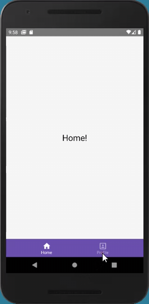
This is the example of simple bottom tabs without Title bar in the top.
Bottom Tabs With Title Bar
So far what we have created is simple Bottom tabs Only without Title bar on the top. If you want title bar also, then we have to use Stack Navigator with navigation options.
Stack Navigator Provides a way for your app to transition between screens where each new screen is placed on top of a stack.
Follow These steps to start using Stack Navigator:-
- Installing Stack Navigator,To install Stack Navigator, we need to install its additional dependencies also. So use the following command :
npm install react-navigation-stack @react-native-community/masked-view react-native-safe-area-context
- Then Import stack navigator from library in your App.js as given below:
import { createStackNavigator } from 'react-navigation-stack';
- Then create seperate stack navigator for both of the screens as given below:
/**Somewhere in the code**/
const HomeTab = createStackNavigator({
    Home: { screen: HomeScreen,
      navigationOptions: () => ({
        title: `React Native Bottom Tabs`,
      }),
    }
  });

  const ProfileTab = createStackNavigator({
    Profile: { screen: ProfileScreen,
      navigationOptions: () => ({
        title: `React Native Bottom Tabs`,
      }),
     }
  });
- Then modify Home and Profile route config’s values to these stack navigators as given below:
const TabNavigator = createMaterialBottomTabNavigator(
  {
    Home: HomeTab,
    Profile: ProfileTab,
  },
  {
    defaultNavigationOptions: ({ navigation }) => ({
      tabBarIcon: ({ focused, horizontal, tintColor }) => {
        const { routeName } = navigation.state;
        let IconComponent = Ionicons;
        let iconName;
        if (routeName === 'Home') {
          iconName = `home${focused ? '' : '-outline'}`;
        } else if (routeName === 'Profile') {
          iconName = `account-box${focused ? '' : '-outline'}`;
          //iconName = `ios-options`;
        }
        // You can return any component that you like here!
        return <IconComponent name={iconName} size={25} color={tintColor} />;
      },
    }),
    tabBarOptions: {
      activeTintColor: 'tomato',
      inactiveTintColor: 'gray',
    },
    barStyle: { backgroundColor: '#694fad' },
  }
);
createStackNavigator(RouteConfigs, StackNavigatorConfig) Explained
This method has following structure: It takes two parameters. Where RouteConfigs object is a mapping from route name to a route config, which tells the navigator what to present for that route. And StackNavigatorConfig includes various options for Router and Visual options. Some of them are given below:
StackNavigatorConfig
Options for the router:
- initialRouteName – Sets the default screen of the stack. Must match one of the keys in route configs.
- initialRouteParams – The params for the initial route
- initialRouteKey – Optional identifier of the initial route
- navigationOptions – Navigation options for the navigator itself, to configure a parent navigator
- defaultNavigationOptions – Default navigation options to use for screens
- paths – A mapping of overrides for the paths set in the route configs
Visual options:
- mode – Defines the style for rendering and transitions:
- card – Use the standard iOS and Android screen transitions. This is the default.
- modal – This does few things:
- Sets
headerModetoscreenfor the stack unless specified - Prevents last inactive screen from being detached so that it stays visible underneath the active screen
- Make the screens slide in from the bottom on iOS which is a common iOS pattern.
- Sets
- headerMode – Specifies how the header should be rendered:
- float – Render a single header that stays at the top and animates as screens are changed. This is a common pattern on iOS.
- screen – Each screen has a header attached to it and the header fades in and out together with the screen. This is a common pattern on Android.
- none – No header will be rendered.
- keyboardHandlingEnabled – If
false, the on screen keyboard will NOT automatically dismiss when navigating to a new screen. Defaults totrue.
navigationOptions for screens inside of the navigator:
Some of the navigation options are given below. You can check full list of navigationOptions from its official link.
title
String that can be used as a fallback for headerTitle. Additionally, will be used as a fallback for tabBarLabel (if nested in a TabNavigator) or drawerLabel (if nested in a DrawerNavigator).
header
Function that given HeaderProps returns a React Element, to display as a header.
headerShown
Whether to show or hide the header for the screen. The header is shown by default unless headerMode was set to none. Setting this to false hides the header.
When hiding the header on specific screens, you might also want to set headerMode option to screen.
headerTitle
String or a function that returns a React Element to be used by the header. Defaults to scene title. When a function is specified, it receives an object containing allowFontScaling, style and children properties. The children property contains the title string.
headerTitleAlign
How to align the header title. Possible values:
leftcenter
Defaults to center on iOS and left on Android.
headerTitleAllowFontScaling
Whether header title font should scale to respect Text Size accessibility settings. Defaults to false.
headerBackAllowFontScaling
Whether back button title font should scale to respect Text Size accessibility settings. Defaults to false.
headerBackImage
Function which returns a React Element to display custom image in header’s back button. When a function is used, it receives the tintColor in it’s argument object. Defaults to Image component with react-navigation/views/assets/back-icon.png back image source, which is the default back icon image for the platform (a chevron on iOS and an arrow on Android).
headerBackTitle
Title string used by the back button on iOS. Defaults to the previous scene’s headerTitle.
headerBackTitleVisible
A reasonable default is supplied for whether the back button title should be visible or not, but if you want to override that you can use true or false in this option.
headerTruncatedBackTitle
Title string used by the back button when headerBackTitle doesn’t fit on the screen. "Back" by default.
headerRight
Function which returns a React Element to display on the right side of the header.
headerLeft
Function which returns a React Element to display on the left side of the header. When a function is used, it receives a number of arguments when rendered (onPress, label, labelStyle and more – check types.tsx for the complete list).
headerStyle
Style object for the header. You can specify a custom background color here, for example.
headerTitleStyle
Style object for the title component
So our modified final App.js looks like this:
App.js
import React from 'react';
import { Text, View } from 'react-native';
import { createAppContainer } from 'react-navigation';
import { createMaterialBottomTabNavigator  } from 'react-navigation-material-bottom-tabs';
import Ionicons from 'react-native-vector-icons/MaterialCommunityIcons';
import { createStackNavigator } from 'react-navigation-stack';
class HomeScreen extends React.Component {
  render() {
    return (
      <View style={{ flex: 1, justifyContent: 'center', alignItems: 'center' }}>
        <Text style={{fontSize:25}}>Home!</Text>
      </View>
    );
  }
}
class ProfileScreen extends React.Component {
  render() {
    return (
      <View style={{ flex: 1, justifyContent: 'center', alignItems: 'center' }}>
        <Text style={{fontSize:25}}>Profile!</Text>
      </View>
    );
  }
}
const HomeTab = createStackNavigator({
  Home: { screen: HomeScreen,
    navigationOptions: () => ({
      title: `React Native Bottom Tabs`,
      headerStyle:{
        backgroundColor: '#694fad'
      },
      headerTitleStyle:{
       color:'#ffffff'
      }
    }),

  }
});
const ProfileTab = createStackNavigator({
  Profile: { screen: ProfileScreen,
    navigationOptions: () => ({
      title: `React Native Bottom Tabs`,
      headerStyle:{
        backgroundColor: '#694fad'
      },
      headerTitleStyle:{
       color:'#ffffff'
      }
    }),
   }
});
const TabNavigator = createMaterialBottomTabNavigator(
  {
    Home: HomeTab,
    Profile: ProfileTab,
  },
  {
    defaultNavigationOptions: ({ navigation }) => ({
      tabBarIcon: ({ focused, horizontal, tintColor }) => {
        const { routeName } = navigation.state;
        let IconComponent = Ionicons;
        let iconName;
        if (routeName === 'Home') {
          iconName = `home${focused ? '' : '-outline'}`;
        } else if (routeName === 'Profile') {
          iconName = `account-box${focused ? '' : '-outline'}`;
          //iconName = `ios-options`;
        }
        // You can return any component that you like here!
        return <IconComponent name={iconName} size={25} color={tintColor} />;
      },
    }),
    tabBarOptions: {
      activeTintColor: 'tomato',
      inactiveTintColor: 'gray',
    },
    barStyle: { backgroundColor: '#694fad' },
  }
);
export default createAppContainer(TabNavigator);
You can play around with the various options in Bottom Tabs by changing their background color, active color and inactive color etc..
So our final Bottom Tabs App look like this:
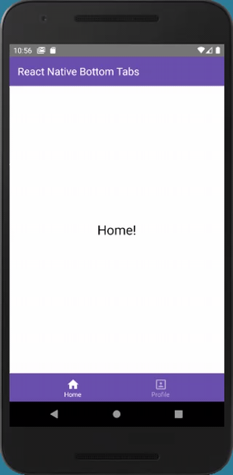
Hurrah! you have created the Bottom Tabs in React Native App.
Enjoy Coding!!


